An Architect’s Toolbox – Layered Sketching by Hand
It’s a surprise, sometimes, for potential clients of mine to learn that the bulk of the designing I do is sketching by hand.
Don’t we have computer tools to handle that these days? Isn’t sketching by hand more time-consuming and less accurate?
Yes, actually – it’s both of those things, which is why sketching by hand is a far more useful addition to my architectural toolbox than computer design.
There’s a time for Computer Aided Drafting and Design (CADD) in the design process – I use both Softplan and Sketchup extensively – but neither is a substitute for sketching by hand throughout the life of a design project.
Sketching is time-consuming, in the sense that the sketches I do aren’t final, ready-to-build-from drawings. But the goal of sketching isn’t to quickly arrive at a final design; it’s to explore many design options quickly.
So accuracy suffers, too – but focusing on accuracy while I’m trying out ideas stifles creativity and defeats the whole purpose of the design process.
Eventually, I’ll get the design right and turn it into a buildable document – but only after I’ve tried out many different ideas.
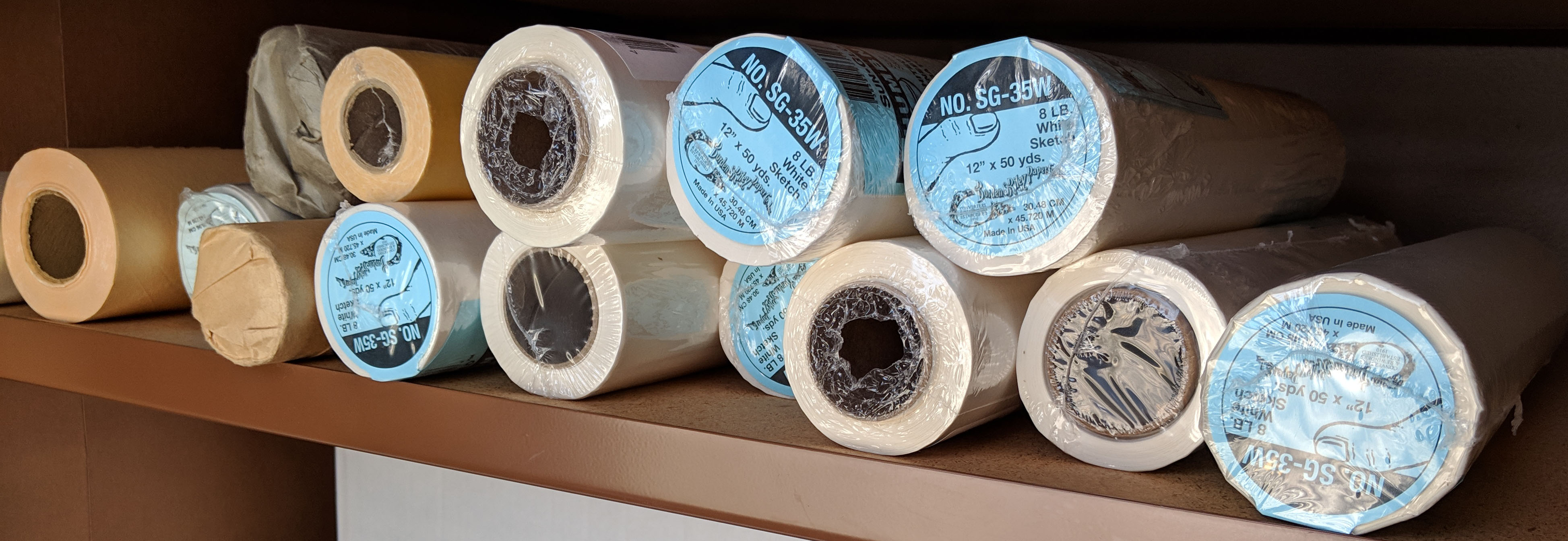
I call my design technique “layered sketching” because I use many layers of translucent tracing paper as I design, adding and subtracting elements on each layer as I work. Sketch paper is cheap, and I use a lot of it. The short video below shows me working with layered sketching on a recent project.
In the video you can see how I’m using layers of sketch paper to try different layouts for a bathroom addition, making notes along the way, and eventually, adding a little color to make the sketch presentable for my client.
This particular project was about getting as much out of a tiny bit of space as possible, fitting a shower, soaking tub, toilet, two sinks, a walk in closet, and a hall bath all into about 222 square feet.
The key here is using hand sketching as a process of rapid exploration and a tool to foster creativity, something CADD is poor at, precisely because it’s too accurate too soon. That’s the CADD “trap” – it’s very easy to draw something that looks accurate and complete, but that doesn’t mean it’s been thought through as much as it should be.
I’ve been hired by more than one client who became disillusioned with the process their designer used – essentially getting to a “solution” very quickly but allowing them little input to the process and no exploration or creativity.
A custom home client I’m working with right now went through that unfortunate exercise with her previous designer. At our third meeting, after we’d explored five rough sketch concepts, and were working with the second version of the preliminary design (still in loose sketch form), she remarked, “I love this process!”
Yep, me too.
The actual tools I’m using in the video above are simple, everyday things that you don’t even need to show your Architect card to buy:
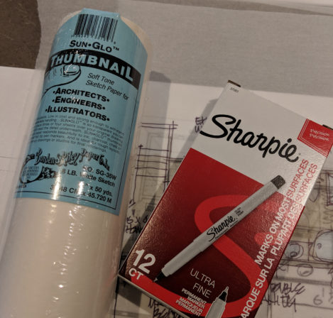
Sun-Glo Thumbnail Soft-tone sketch paper no. SG-35W 12″ x 50 yds. from DraphixDirect
Sharpie Ultra Fine Point Permanent Markers (box of 12) from Staples
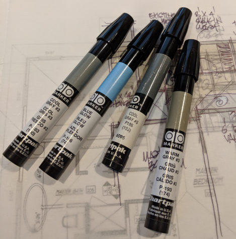
Chartpak AD Design Markers from Blick Art
(Here’s more “toolbox” stuff – a list of my favorite Architectural Books)
