Proper House Proportions: A Trick of the Trade
If you’re a house junkie like me, watching the home shows, reading the home magazines, and looking at houses wherever you go, then you’ve seen good houses and not so good houses. You’ve seen charming homes that seem perfectly settled; you’ve seen houses that seem “complete” – like there’s nothing you could do to make them any better. Those are often the ones with proper house proportions.
And you’ve seen houses that look a little…off. Houses that look like something’s missing, or like something’s not in the right place. Maybe the roof seems a little too tall, maybe the windows seem a little too wide.
And maybe you’ve wondered – are there tried and true ways to help assure that a house design will look “just right”?
Indeed there are, and one of those ways is to design using correct proportions.
Math wasn’t my strongest subject in school, but I always had a fascination with geometry. Which worked out well for me, since basic geometry is one of the keys to good house proportions (and doesn’t involve calculus).
Through the centuries, Architects have used geometry to organize the proportions of their buildings in different ways – but almost everyone, from Le Corbusier to Michael Graves, has used some sort of proportional organizing scheme in their work.
In fact, a strong geometrical framework is the basis of great buildings going way, way back to the earliest days of Western civilization.
But back to your house.
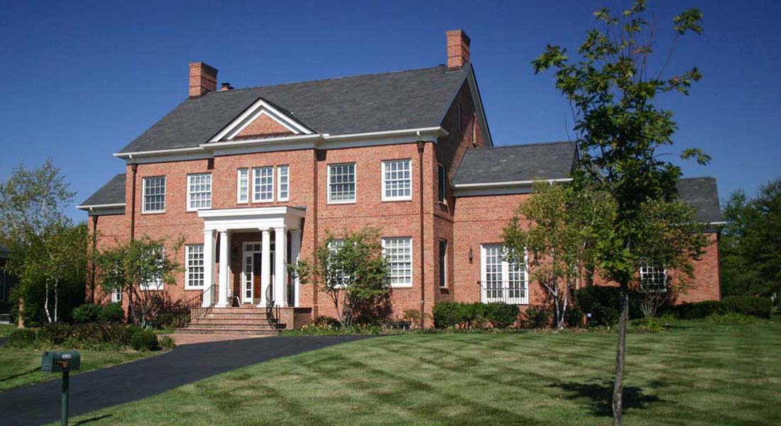
Let’s pick a simple easy home style like Georgian Colonial Revival to work with. This is a style originally brought over to America by English colonists during the reign of – you guessed it – Kings George I through IV, and is characterized by simple, symmetrical massing.
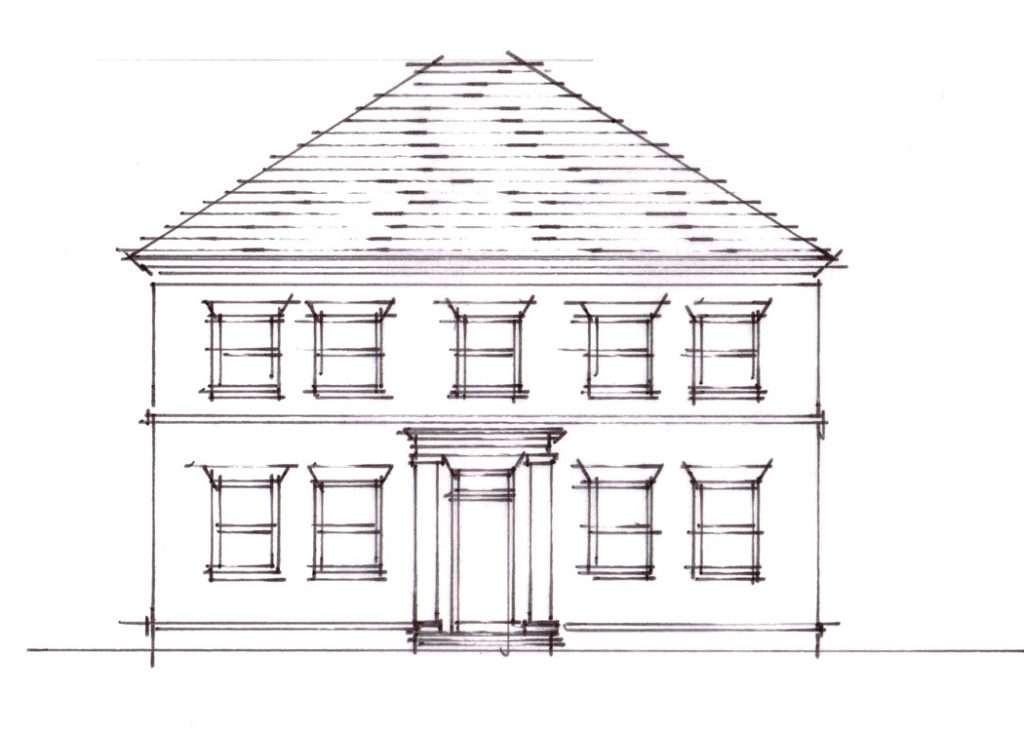
The quick sketch above is an attempt at a basic Georgian Colonial design – not too terrible, but to my eye, there’s a lot wrong with it – mostly having to do with proportions. Among other things, the roof is too tall, and the windows are too “squat” – too wide for their height.
Fortunately, both issues are very easily corrected to look just right.
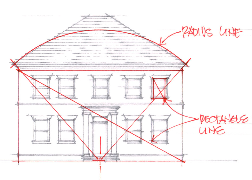
In this sketch, I’ve drawn a simple radius line, starting at the bottom center of the house and ending at the roof edge. The top of the segment that radius creates sets the proper height of the roof. Done!
I’ve also drawn a line connecting opposite corners of the big rectangle formed by the main facade. This is our primary proportion line, and we’re going to use it to proportionally size the other rectangles on the facade – in this case, the windows.
We’ll turn that big rectangle 90 degrees to match the orientation of the windows, then draw that same angled line from one of the top corners of each window. The result is a window proportion (width to height) that matches the proportion of the main rectangle of the house.
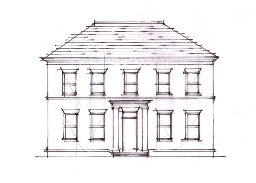
Applying both of these proportion strategies to the original design, we end up with this:
Much better! I’ve simplified the process a bit, and there’s still more to do to get this basic design completely correct. But we’re on the right track towards a house that looks just right.


Hi Richard,
I sat through an hour presentation on "Proportions, Regulating Lines and the Golden Ratio" this past week which I thought was interesting enough to try out one of the Phi programs to see how it applies. The program provides a layer over any screen that you stretch to meet the drawing, photo, etc. that you wish to analyze..and then adjust from center (V & H) for everything…thirds, Golden Rectangle, Fibonacci, Golden Spiral…and many more with just as many variables for grid units.
One drawing of the Parthenon was scarily accurate…from the base step, the purchase floor, up to the entablature…and the width of the entablature and the rake of the frieze at the peak of the gable on the horizontal. The vertical…using the same divisor on units…centered each column to the door with the last division being the overhang on end.
This was a photo that I just pulled out of images in searching for something with a lot of columns…and bingo, the result were just as talked about for many years with regards to early design.
Detail oriented as you are….remember some of your exampled brick jack arches and the brick to brick angling…and with this above example; I was curious of your thoughts on the Golden Ratio and other guidelines for visual effect on your elevations…or the elevations of others.
Thanks for the quick tip on a good point as to where to stop with the ridge and the overall balance and appearance on the front elevation.
Aaron – you're right, on a house where the roof closes to a ridge at the top, you can't just drop with ridge without changing the depth.
There are two ways around that, however, that are particularly useful on the Georgian Colonial style (and the reason I chose it for this example).
First is the proportion of the floor plan itself – in "proper" Georgian style, the width-to-depth of the floor plan is relatively set at about 4:3. Which means that once you've found the right ridge height for a given footprint, the roof pitch is the only remaining variable.
Second, a simple hip roof like the one in this example often has a flat rubber or metal roofing section at the top instead of a hip – so there's no ridge at all, and the height is whatever you want it to be. And that gives you more freedom to make the footprint something other than perfect 4:3 proportions.
It gets trickier with other design styles, but having an organizing scheme at the start is a great way to help keep a design from getting out of control!
I'm an architect and have been taught many times about proper proportions, and yet your post cuts through much of the mystery with some practical application of it. Thank you! One question though, the height of the roof is determined by how deep the house is, how can you just shorten the roof without also changing the footprint of the house?
Changing the pitch of the roof would change the ridge of the house, is this what you have found in your experience?
Brilliant demonstration. Practical application is always the best instructor for me. Thank you!
You’re welcome, glad you enjoyed it!