The Difference Between “Symmetry” and “Balance” in Home Design
My clients occasionally ask me for symmetrical home designs. Sometimes that’s because they appreciate the elegance of symmetry, and sometimes it’s because symmetry is easier to understand.
Symmetry is found in all kinds of artistic composition, but so is asymmetry. What’s more important is balance – balance between the colors in a painting, the elements of architectural design, or the lines of a popular song.
I wouldn’t have the slightest idea how to write a song, but I can’t help but notice some similarities between what I hear in music and what I see in architecture.
“The rangers had a homecoming in Harlem, late last night
And the magic rat drove his sleek machine, over the Jersey state line
Barefoot girl, sitting on the hood of a Dodge drinking warm beer in the soft summer rain
The rat pulls into town, rolls up his pants
Together they take a stab at romance and disappear down Flamingo lane”
The rhyme in the first lines of Bruce Springsteen’s “Jungleland” is subtle and complex, but there’s a balance and flow to the verse that helps make it one of the best in rock ‘n roll (in my humble opinion).
On the other hand, Springsteen’s “Hungry Heart” is simple, straightforward, and the short lines rhyme easily:
“Got a wife and kids in Baltimore, Jack
I went out for a ride and I never went back
Like a river that don’t know where it’s flowing
I took a wrong turn and I just kept going”
Both songs are appealing in their own way – one is simple and symmetrical, the other is balanced, but asymmetrical (and one’s a whole lot easier to sing along with!).
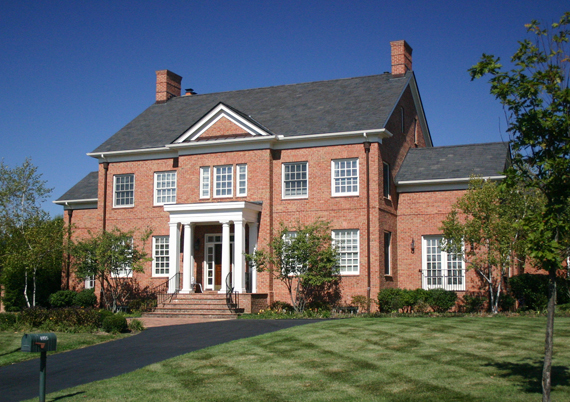
Houses can be that way, too. The classically-styled homes we’re all familiar with (see below) are often perfectly symmetrical. Their appeal is simple and easily understood – it’s no wonder American neighborhoods are filled with them.
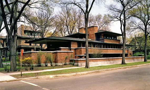
Houses that aren’t perfectly symmetrical however, are sometimes a little harder to understand and to design. Even Frank Lloyd Wright’s asymmetrical, radically different designs weren’t widely understood or appreciated when first published.
Doing it well – that’s the subtle difficulty of designing asymmetrical homes. A bit of simple geometry can ease the task of creating a pleasing symmetrical home, but designing an asymmetrical home is more art than science. Often, it’s a matter or trial and error, changing the massing, and moving elements around until it’s just right.
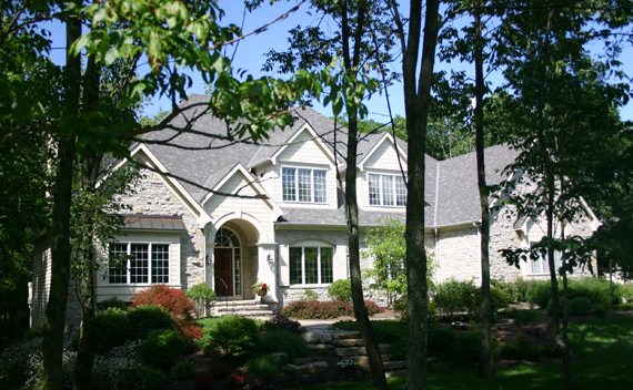
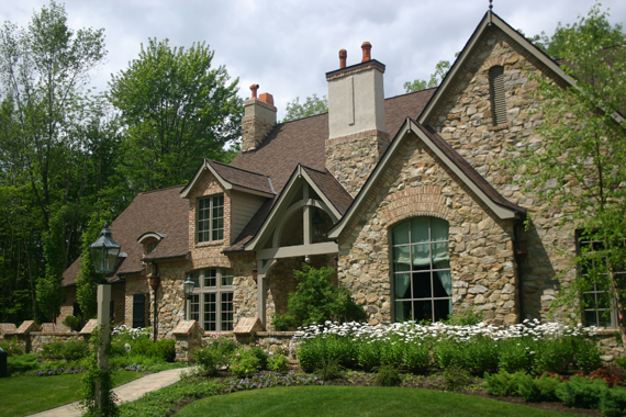
But asymmetrical homes have their own charm and appeal – English Tudor, Queen Anne, French Eclectic, even the popular American Craftsman styles are lovely when well done.
If you’re wondering why I think this should be important to you, it’s because you might get a better home design if you allow yourself to look beyond the familiar, symmetrical house designs you’re probably used to seeing. Good design doesn’t have to be symmetrical.
A well-composed home design that doesn’t obey the laws of strict symmetry can give you far more options of how and where spaces are arranged. In order for the brick Georgian Colonial home below to be perfectly symmetrical on the outside, the door has to be in the exact center of the façade.
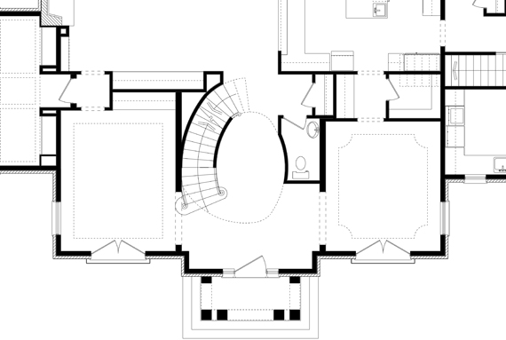
That means the room on the left side of the entry has to be the same size and shape as the room on the right; there’s almost no room to play around with the floor plan of this house.
But the space in the floor plan of another house, freed from the shackles of strict symmetry, moves and flows around the needs of the people that live in it, not the artificial requirements of style. The front door doesn’t have to be in the center, and the rooms can be whatever size and shape you need them to be.
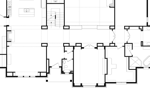
In fact, the idea that home design could be more about purpose than style is one of the biggest differences between American home design before the 20th century and since. It’s what Architect Louis Sullivan was talking about when he said “form follows function” in 1896.
But enough history – what’s important to remember is that the design of your house doesn’t have to be constrained by the requirements of style, or the necessities of symmetry. Your house might be a lot more interesting, and much more closely fit to your family’s lifestyle, if you put “function” first.


