Less is More in This Mid-Century Modern Kitchen Remodel
Some kitchens require a total makeover, but sometimes, working with what you’ve already got is all you need to do. That was the case with this little Mid-Century Modern kitchen remodel, where taking down the top half of a wall between the kitchen and casual dining area made all the difference.
Most of the existing custom cabinets were kept; a few were moved; and a little bit of good carpentry filled in the gaps.
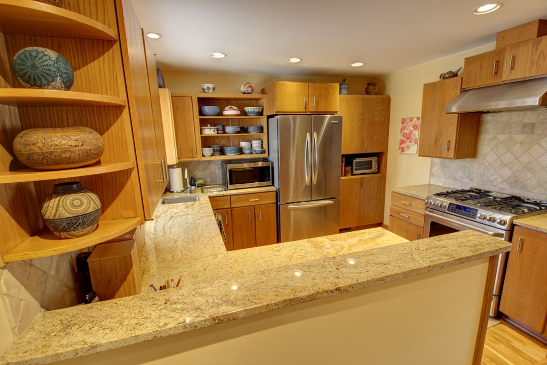
The half-wall in the foreground was once a full-height wall, with just a doorway separating it from the casual dining area. Taking the wall down to half-height was the biggest change we made to the kitchen.
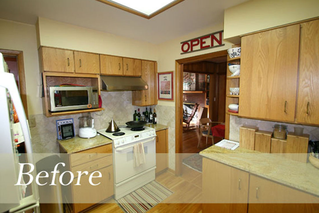
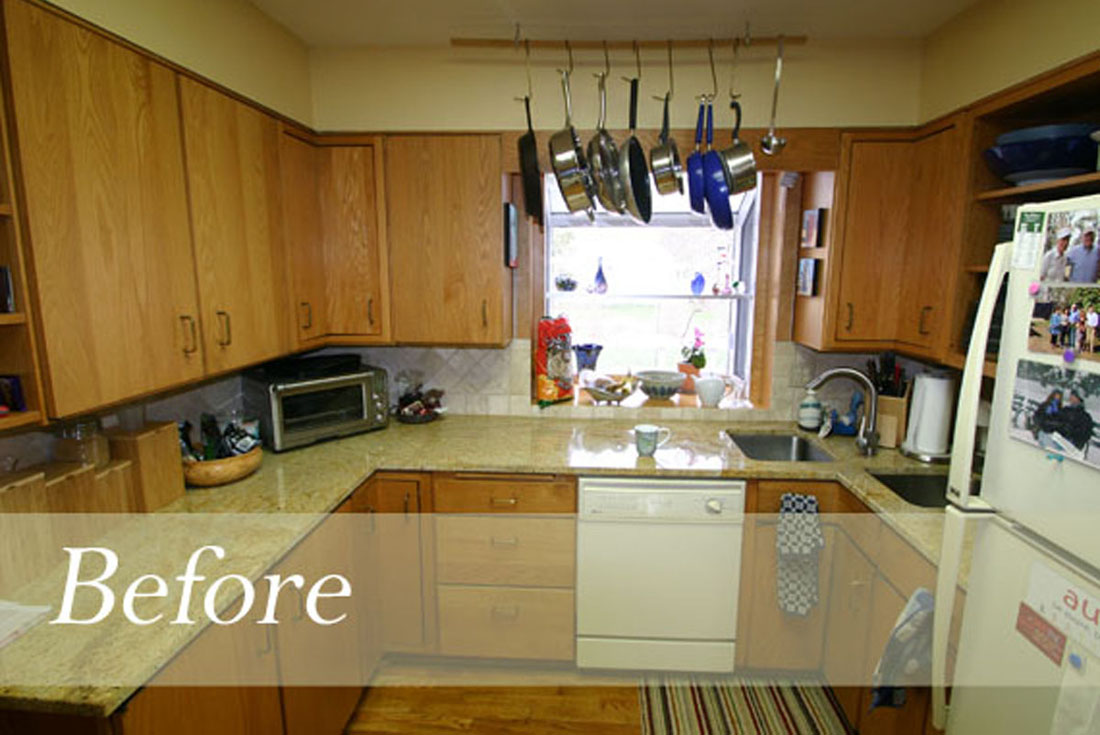
From inside the original kitchen, you can see how the full-height wall on the right closed the kitchen off almost completely. The soffits didn’t help either – they were all taken out.
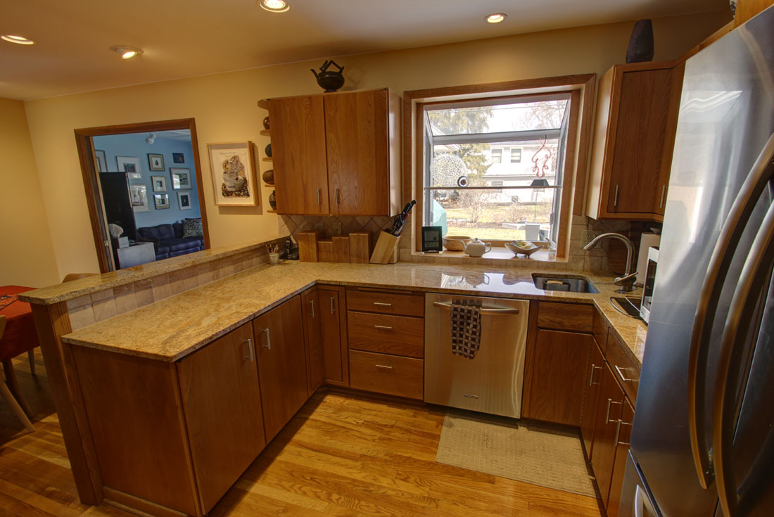
Here’s that same view – new tile matches the original, as does the new granite counter on top of the half wall. But the dramatically improved view is what this mid-century modern kitchen remodel is really all about.
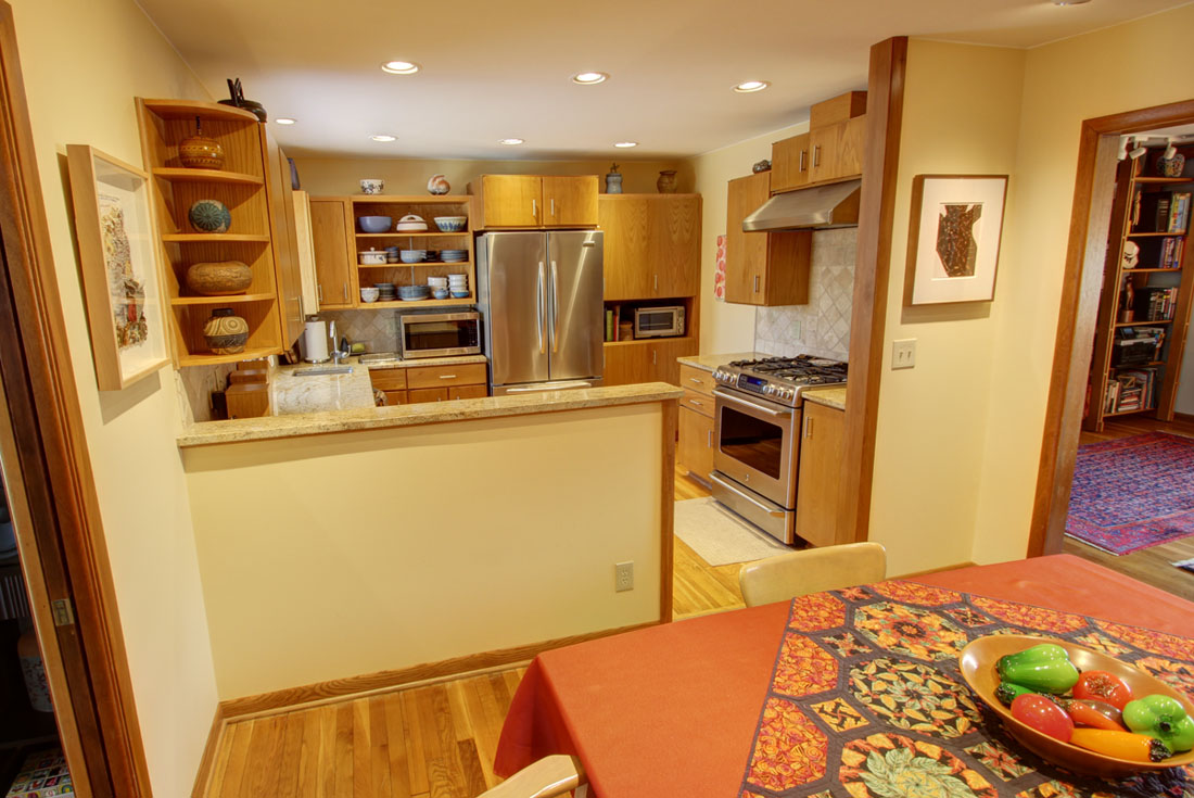
From the casual dining area, the change is obvious!
Inside the old kitchen – all of the upper cabinets on the left side of the picture were relocated or removed; the refrigerator was replaced with one that is flush with the cabinets.
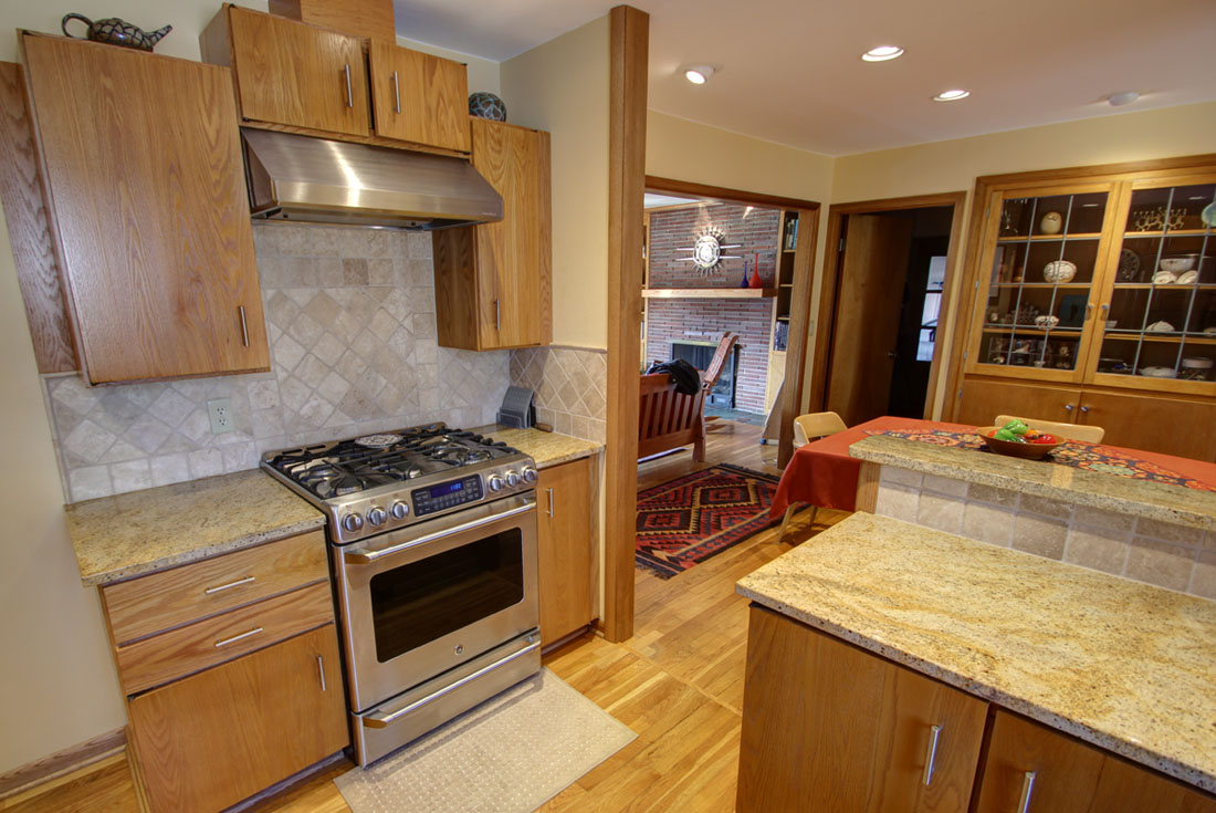
The same view after the remodeling!



Thanks Cheryl! When possible, I'm in favor of making rooms open-er and light-er! 🙂
I always enjoy seeing what else can be done, staying within the existing spaces. And key words for us are OPEN and LIGHT. Very nice.
Thanks for the kind words! It's about solving problems at the heart of it, right?
I don't normally post comments online, but I wanted to point out how rare and admirable it is for an architect to talk a client into a small/simple solution when more money could have been made from a big/complex remodeling. Nicely done.